How I created my pop-up cards brand, coded a website to show the products and redesigned it later to launch an online store.
WEB DESIGN
Web & Graphic designer
Personal project
1st web: 2015
Redesign: 2018
Html | Css | JQuery | WooCommerce | Balsamiq | Illustrator | Photoshop | Mailchimp | Stripe
Web design | Graphic design | Illustration | Lettering | Digital Marketing
Web & Graphic designer
Personal project
1st web: 2015
Redesign: 2018
Html | Css | JQuery | WooCommerce | Balsamiq | Illustrator | Photoshop | Mailchimp | Stripe
Web design | Graphic design | Illustration | Lettering | Digital Marketing
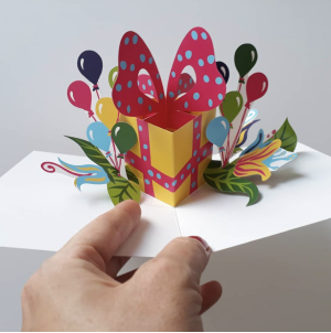
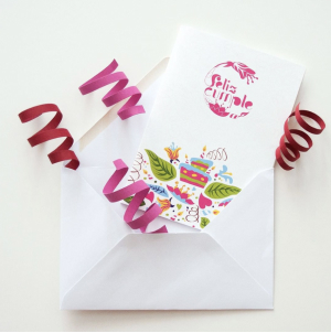
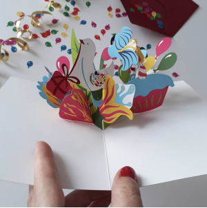
After I had completed my graphic design degree studies in 2013 I created a line of pop-up cards. I designed the pop-up mechanisms (paper engineering), created all the illustrations, designed 2 types of lettering for the covers and the visual identity of the brand.
I designed a website from scratch with HTML and CSS to show the cards. Later, when I decided to sell them online as well, I needed an E-Commerce.
The first website was a mere visual showcase with no strategy behind. With the redesign I managed to guide the user through the content and prepare the website for the leads conversion.
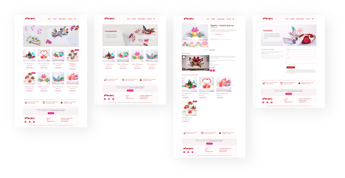
I implemented E-Commerce and connected the virtual payment gateway with Stripe. I created a Lead Magnet, connected the forms with Mailchimp and attracted traffic from the social networks.
Popapea is a brand of handmade with love pop-up greeting cards.
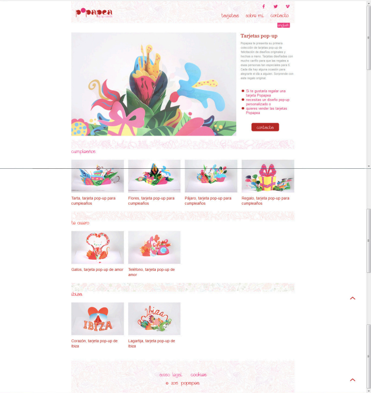
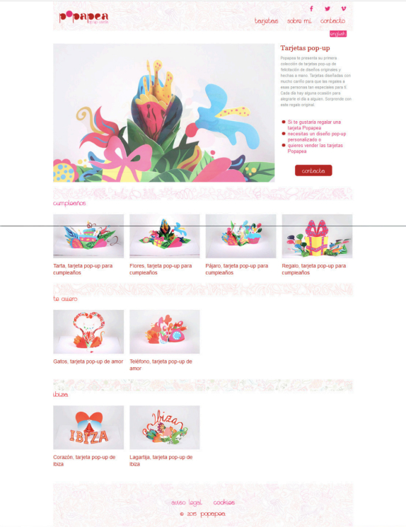
The website has practically no traffic, it is just a showcase website. After the redesign users are expected to come to know the products and buy.
On the current Home page it isn’t clear what the user is supposed to do once he lands there.
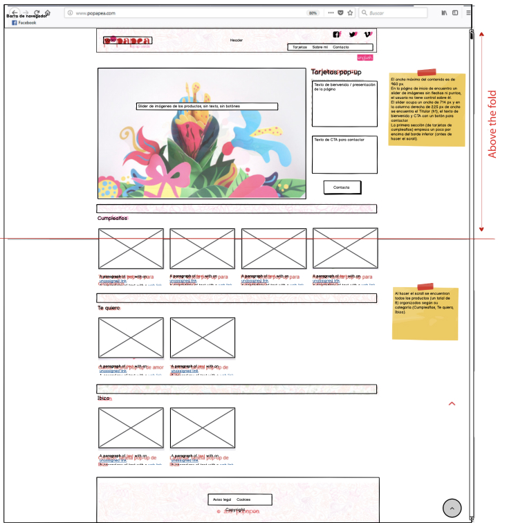
The maximum width of the content is 960 px.
On the home page’s hero there is an image slider without arrows or dots, the user has no control over it.
The slider is 714 px wide. In the right 225 px wide column, there is H1 headline, welcome text and a button with CTA to contact.
The first section (birthday cards) starts at the fold limit, you need to scroll to see it.
When scrolling, all the products are organized according to their category.
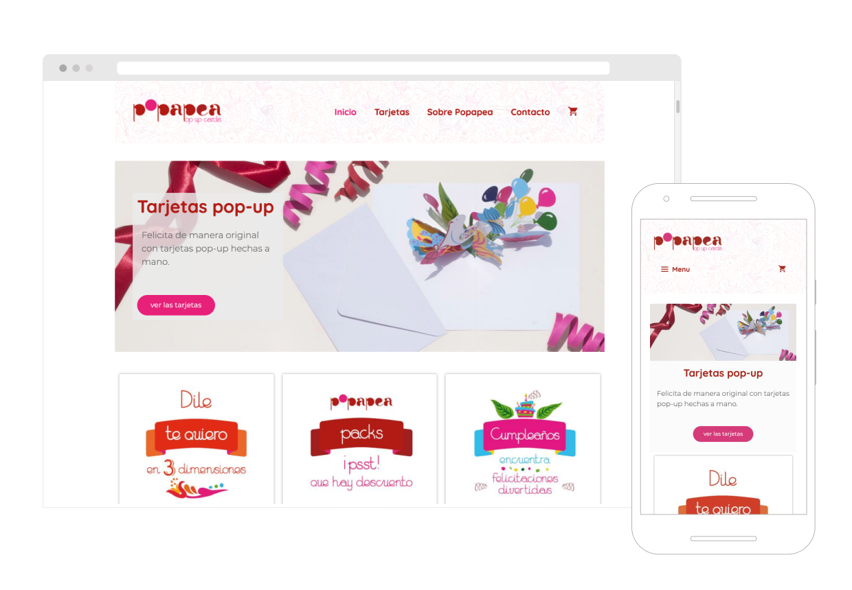
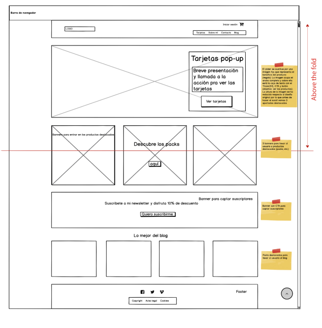
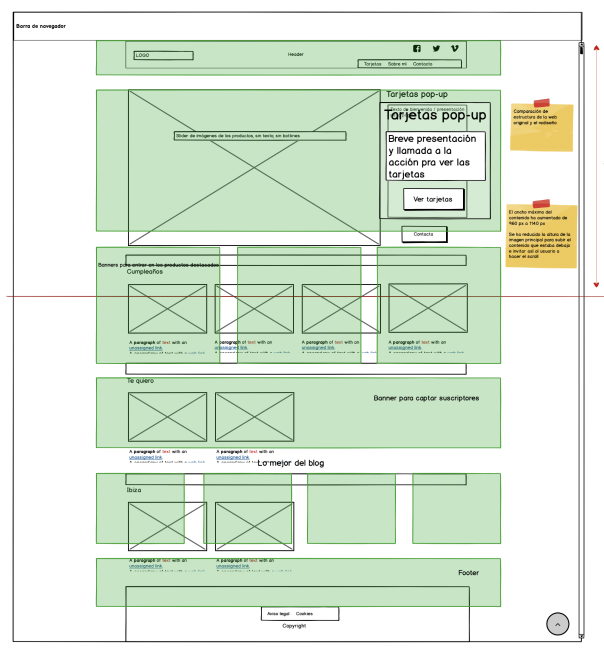
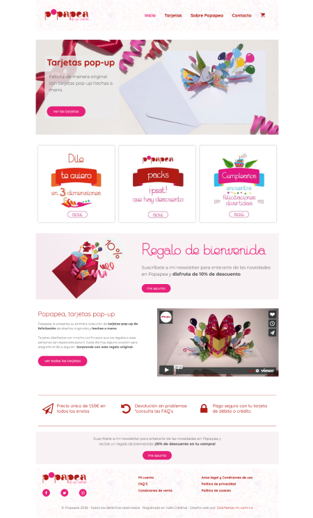
The maximum width of the content has been increased to 1140 px.
The slider is replaced by an image that represents the benefit of the product (gift). The image occupies the full width and a text box with the H1 headline , CTA and button is placed on it (objective: see the products).
The height of the image has been reduced compared to the original design, so before scrolling we can see 3 highlighted sections. There are 3 banners to take the user to featured products.
Next there is a banner to attract subscribers. Below are featured posts to take the user to the blog.
You can visit the website here:
Necessary cookies are absolutely essential for the website to function properly. This category only includes cookies that ensures basic functionalities and security features of the website. These cookies do not store any personal information.
Any cookies that may not be particularly necessary for the website to function and is used specifically to collect user personal data via analytics, ads, other embedded contents are termed as non-necessary cookies. It is mandatory to procure user consent prior to running these cookies on your website.