CLIENT
SDL

The world’s leading provider of technology-enabled language, content management and intellectual property services.

Note: SDL was recently acquired by RWS. It is the biggest acquisition in the translation market all over the world.

PRODUCT
SDL SLATE

It is an app that provides an online business translation service, with AI-powered translation and supported by translators.

Note: SDL SLATE is in the process of changing its name to Translation on Demand.

Team

I work in a cross-functional team. As a part of the UX team, I work together with the client’s product team in the definition and design of their product. We work in an agile environment with 3-week sprints.

I have been involved in Research, UX Design, Visual Design, Prototyping and UX documentation.

To highlight some of my contributions to the project:

  • create and maintain the component library using the Atomic design approach
  • adapt the designs to integrate localization
  • redesign the Subscription plans page
  • consolidate error messages
  • redesign the main area where all Orders are display

Improving the User experience in the Orders area

Improving the User experience in the Orders area

THE PROBLEM

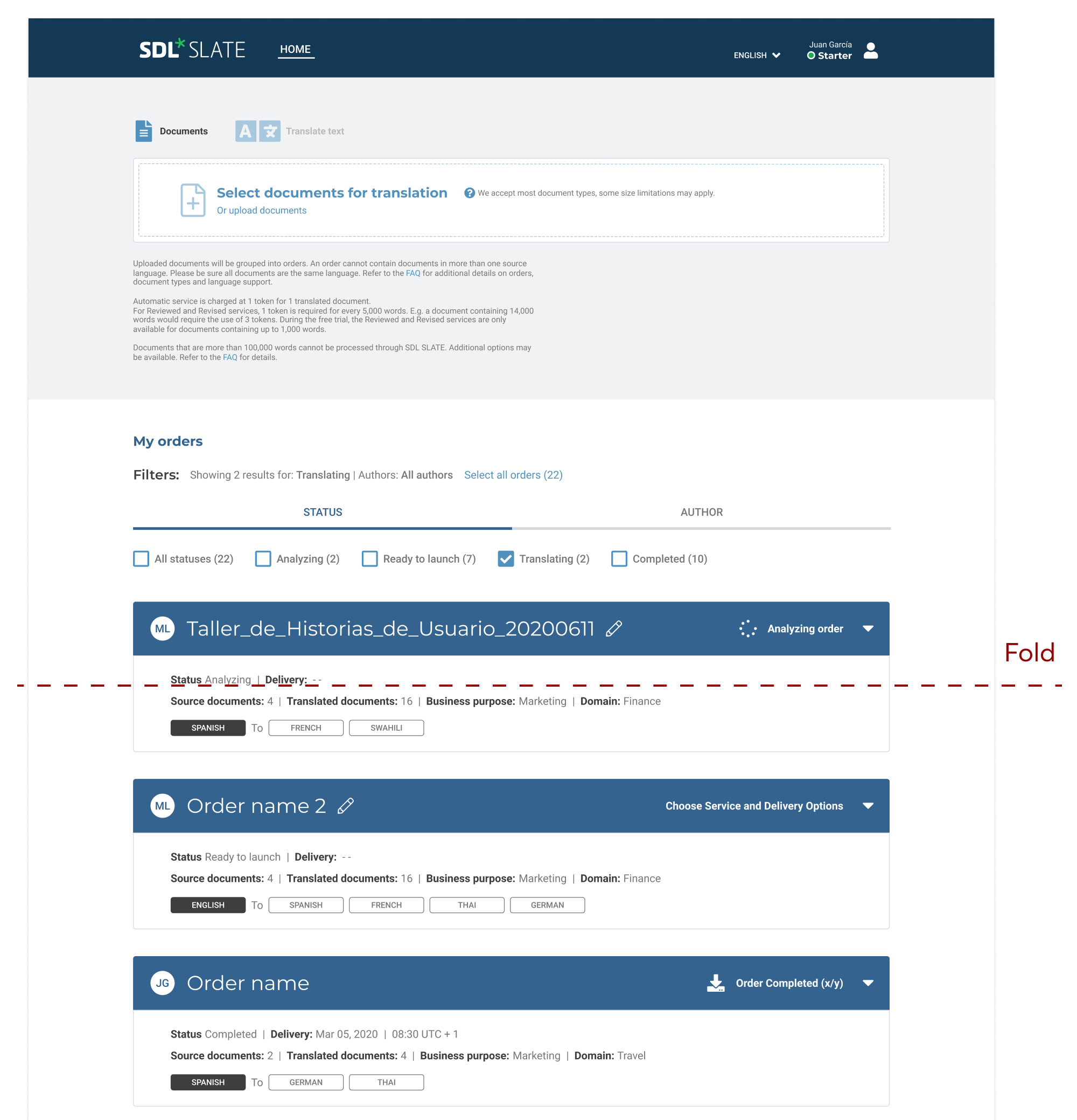
The current design has a lot of white spaces which shifts the content further below. This causes that the users have to scroll a lot in order to find the order they are looking for.

Technical constrains:
Pagination, sorting and search are not possible at this moment.

Business requirements:
We can not separate the Create order area from the All orders area – both have to be displayed on the Home page.

THE GOAL

The objective was to improve the user experience when looking for orders, creating or launching them.

Key findings

The users need be able to find easily the order they are looking for. They need to visualize as many orders as possible without scrolling.

*I can not share more details on user research as it is protected information.

First approach

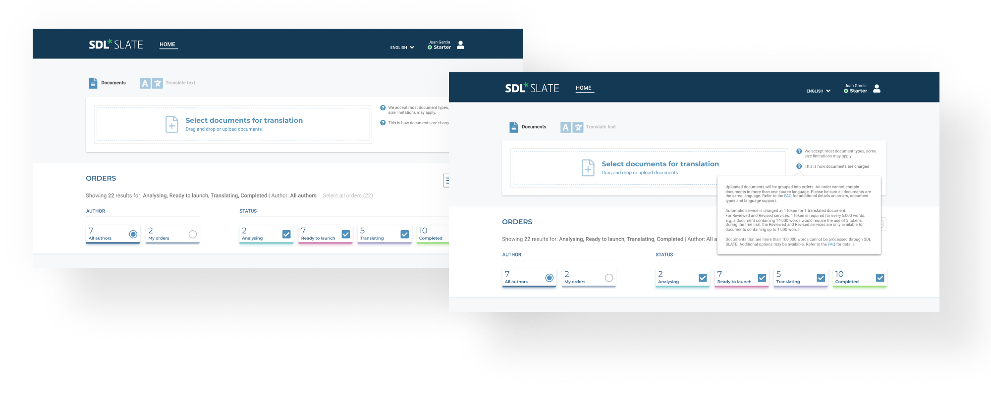
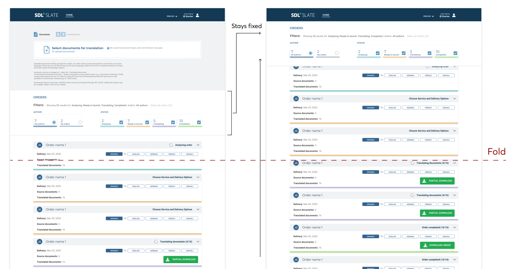
There was a first approach where the filters were turned into a mini dashboard. When clicking on any of the filter cards, the filter section would scroll up and stay fixed, pushing the Drag & drop area upwards. The orders are scrolling underneath the filter section.

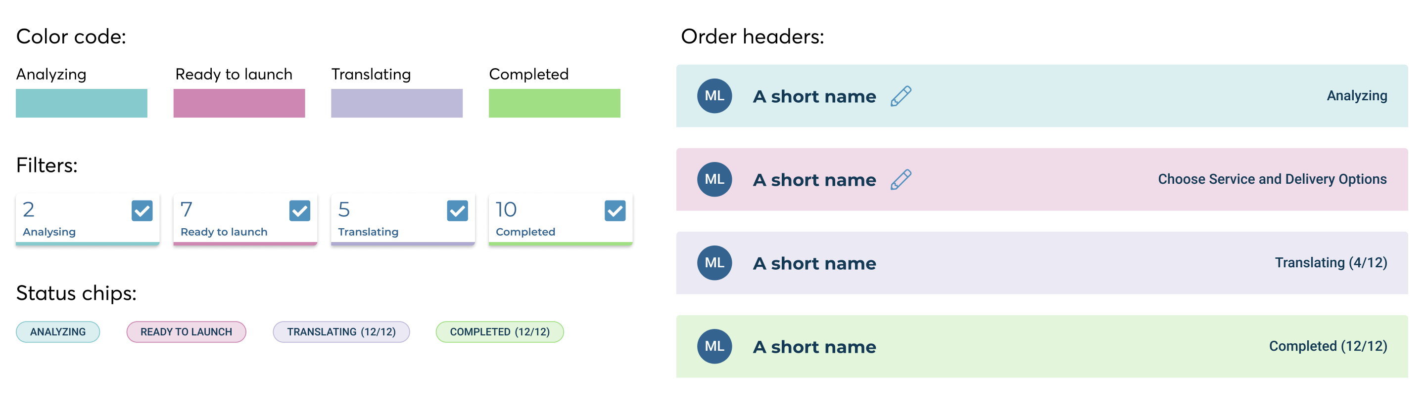
Also, the statuses were color coded in order to make them more recognizable at a glance.

The problem: There are still only 3 orders visible at the same time.

I took over the task from this moment

MY PROCESS

My process is different in different projects and is determined by many factors such as the project goals, business needs, complexity of the problem, time and etc. Here I’ll describe my process for solving this problem.

Analyze / Ideate / Design / Iterate

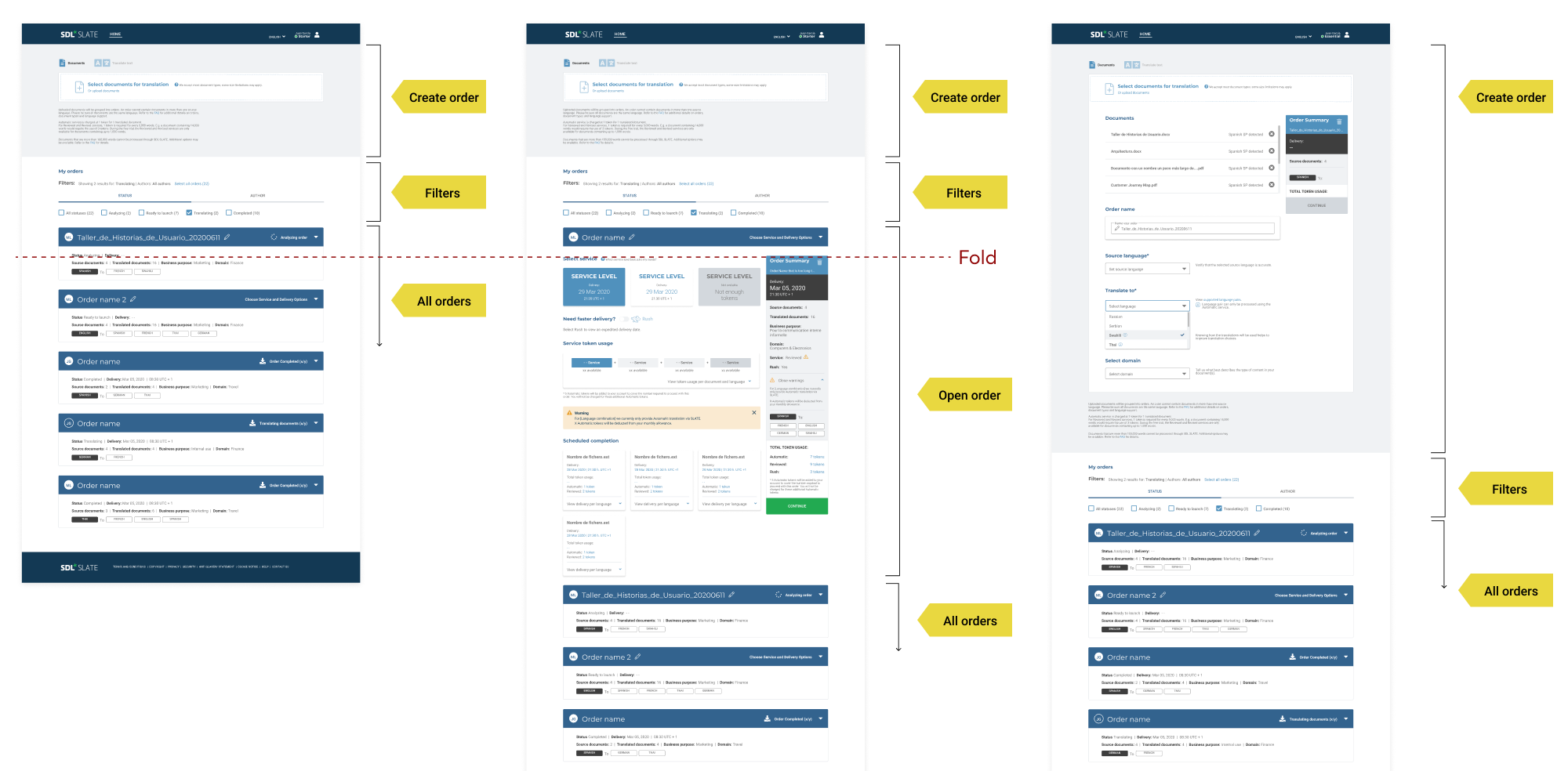
All the important actions take place on the same page.

SITE MAP

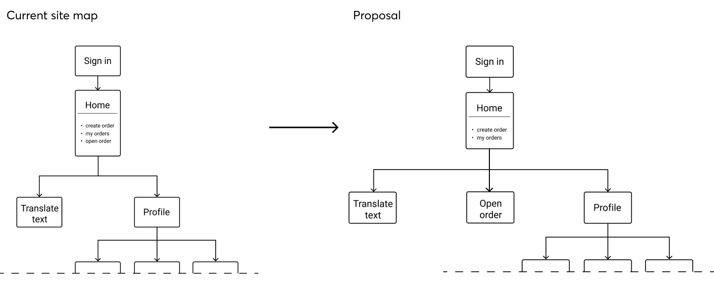
I started analyzing the current site map in order to find possible improvements.

The home page is where the Create order area and All orders area live together. As a requirement of Business, we cannot change this.

Also, when a user opens an order, this simply unfolds, remaining on the same page. This causes performance issues.

User actions that take place on the same page:

  • Creating order
  • Searching for specific order
  • Choosing service level
  • Launching order
  • Downloading translated orders

We can improve the scrolling and performance issues by opening the orders in a separate page.

Create order area

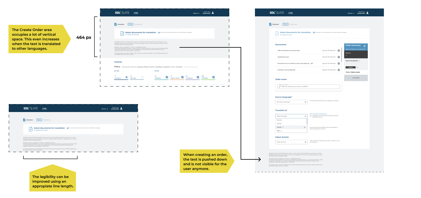
The Create Order area occupies a lot of vertical space.

The text with the information about how the orders are charged has legibility issues and creates a big white space on its right.

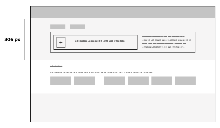
We can gain some vertical space by reducing the width of the Drag & drop area in order to shift the text to its right. Setting the appropriate line length improves the text legibility.

After iterating on the design, the final proposal is to use help icons and display the text in overlay.

All orders area

The orders are displayed as cards. These occupy a lot of space, thus it is not possible to visualize more than 3 orders at the same time.

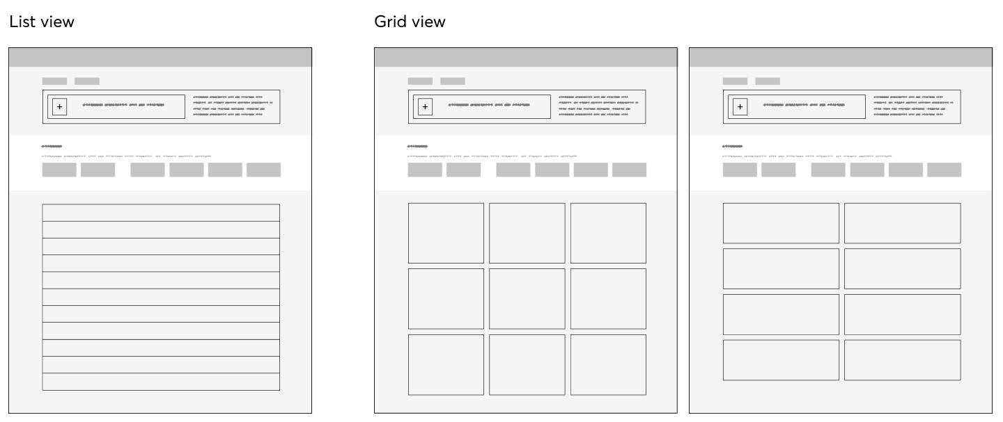
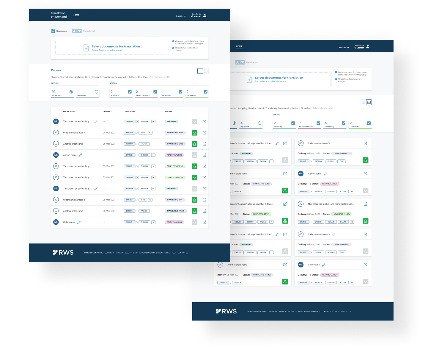
Our users are in the search mode and the order name is one of the most important things for them. A list view would allow them to easily view different textual items. But we have users who are already used to browse the cards. To satisfy both behaviors, we propose the possibility to switch between two different views, list and grid.

From card to table row

In order to reduce the height, we need to show only the most important information. The rest can be found once the order is open. This helps us to reduce the cognitive load as well.

In the first approach, there was a color code proposed for the filter buttons. We have applied this to the status chips and the order headers as well.

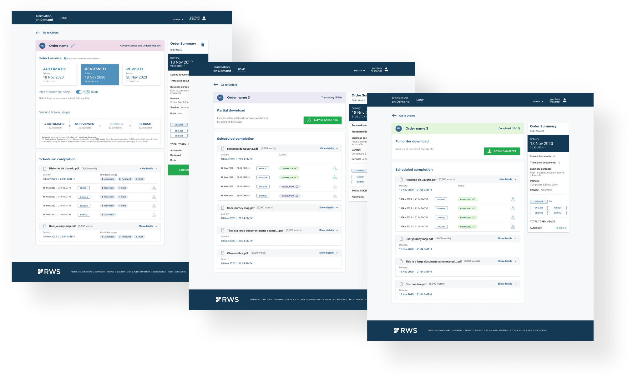
As we have proposed to open the orders in dedicated pages, rather than unfolding them on the same page, this task implied also the design of these pages. This means designing the open order page in 4 different stages according to the order status: Analyzing, Ready to launch, Translating and Completed. 

This also implied to design the navigation from the open order to the orders list depending on the current status of the order and the filtering applied on the order list.

Furthermore, I have created all the new components for the library with the Atomic design approach. This help us to create the flows much faster.
Approved design

We received a very positive feedback on the new design from our users

Working on this task I learnt how